Email metrics
The Metrics page shows how your workspace's email is doing: how much of it reached the inbox, how recipients engaged, and whether your bounce or complaint rates are drifting toward trouble. Every number aggregates everything the workspace sends.
Open Email > Metrics in the dashboard. Outbound shows sent mail and opens by default. Inbound shows mail your workspace receives. To inspect one message or recipient, use the email log. To read the same aggregates programmatically, use the stats API.
Read your metrics
Everything in this section is the Outbound tab. The range picker offers Last 24 hours, Last 7 days, Last 30 days, and Last 90 days, and every number on the page follows it. The default range is 30 days.

Rates use event time for attribution. Send time does not affect which range includes an event. A click that arrives today for a message sent last week counts toward today, and a bounce counts when it arrives rather than when the message went out. The figures come from a rolling aggregation and trail live traffic by a few seconds, so reloading picks up anything newer.
Delivery rate and bounce rate share a denominator, delivery attempts: the messages a receiving server accepted plus the ones it refused. A late bounce that retracts an earlier acceptance moves that recipient out of the delivered count and into the bounced one.
Filter the page
Filters scopes the four cards, all three charts, and the latency table to a single Category, Sending domain, Recipient domain, Tag, Template, or Sending IP. Pick a dimension on the left of the menu, then its value on the right; the longer lists are searchable and offer your top 200 values by volume.
Only one filter applies at a time, so choosing a value replaces whatever was set before rather than narrowing further. The button reads back what is in effect, and the X beside it returns you to everything.
Breakdowns is deliberately left unscoped. It keeps ranking every sender, so you can read the one you filtered to against the field it sits in, and it says so while a filter is on.
The four health cards
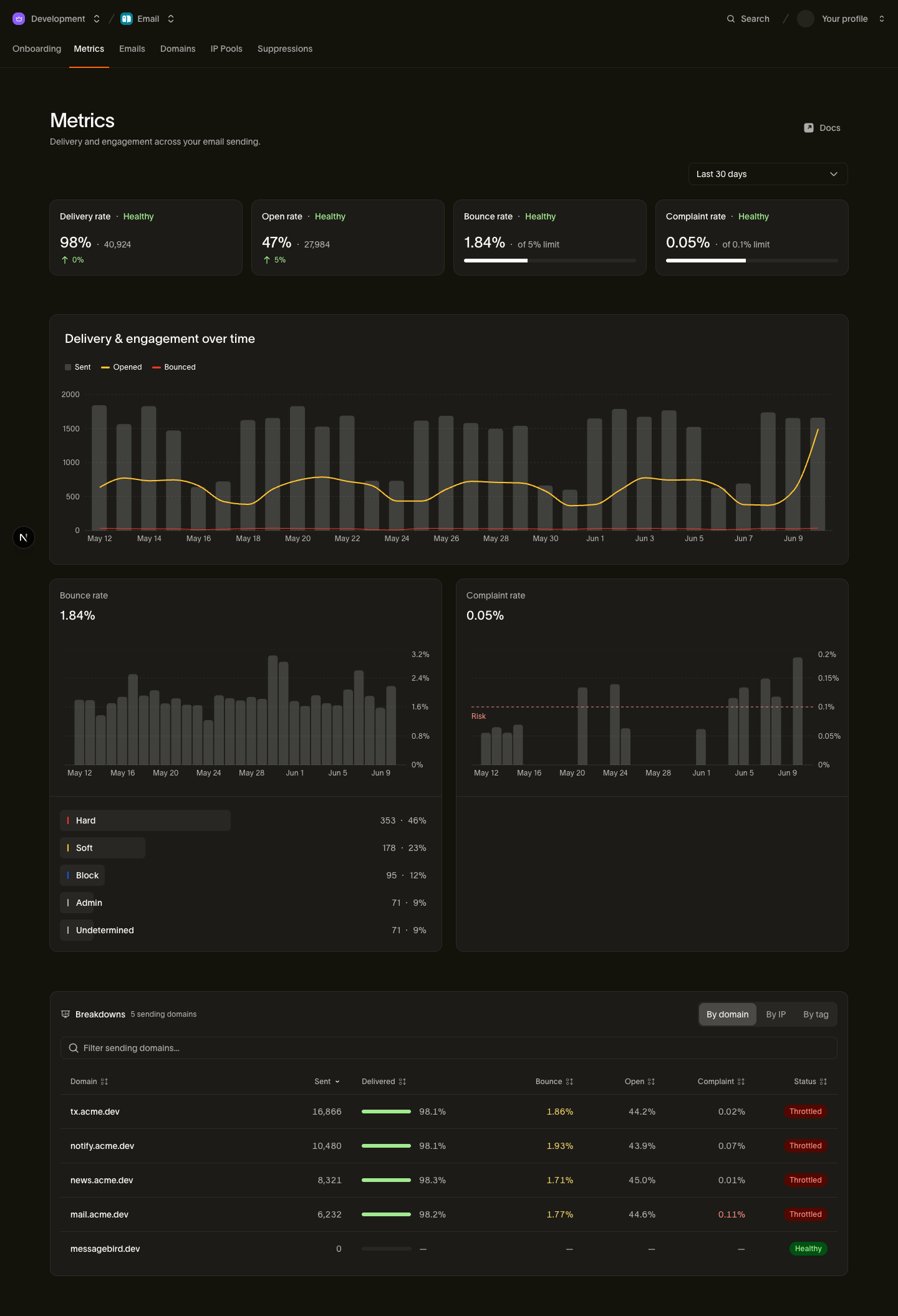
Each card shows a rate for the selected range, the count behind it, the change against the previous equal-length period, and a Healthy or Risk label.
- Delivery rate: deliveries that stuck, over delivery attempts. Healthy above 95%. Below that, something is refusing your mail, and the bounce breakdown says what: dead addresses, an authentication gap, or receiving servers turning your sending IP away.
- Open rate: unique opens over delivered mail, one open per recipient. Mail privacy features fetch images automatically, and those fetches are left out of this rate; Apple Mail Privacy and open tracking covers why that still leaves opens a soft signal. Healthy above 35%.
- Bounce rate: every bounce, including late ones, over delivery attempts. The card shows your rate against a 5% limit and flips to Risk at 5% or above. Sustained high bounces are a list-hygiene problem and they cost you sending reputation.
- Complaint rate: spam reports over delivered mail. The limit is 0.1%, low because mailbox providers act on complaints quickly. Watch this one hardest.
A card reads Healthy up to its limit, so Healthy is not the same as good. The exact formula behind each rate is documented per field on the stats summary reference.
Delivery & engagement over time
The main chart plots Sent, Opened, and Bounced volume across the range, which is where a bad send, a list import gone wrong, or a campaign that landed well shows up. Buckets are hourly over 24 hours and daily over longer ranges.
Beneath the chart, a row gives the period it covers and each series' total across it: Sent, Opened, and Bounced.
Bounce rate and its causes
The bounce card breaks your bounces down by cause, so a rising rate points at a fix:
- Hard: a permanent failure, such as an invalid address or a domain that does not exist. These suppress the address automatically.
- Soft: a transient failure, such as a full mailbox or a server that was briefly unavailable. We retry these.
- Block: the receiving server refused your sending IP.
- Admin: an administrative refusal, such as relaying denied or a blocklisted domain.
- Undetermined: the server's response was too ambiguous to classify.
- Out-of-band: a late bounce that arrived after the receiving server had already accepted the message. It retracts that acceptance, so the recipient becomes bounced.
These are the same bounce_type values the event stream uses, and the bounce classification table maps them to the finer-grained codes.
Complaint rate
The complaint card charts your spam-complaint rate across the range. Since the limit is so low, watch the shape as much as the number: a steady climb well under 0.1% is an early warning that a segment or a campaign is annoying people.
Latency
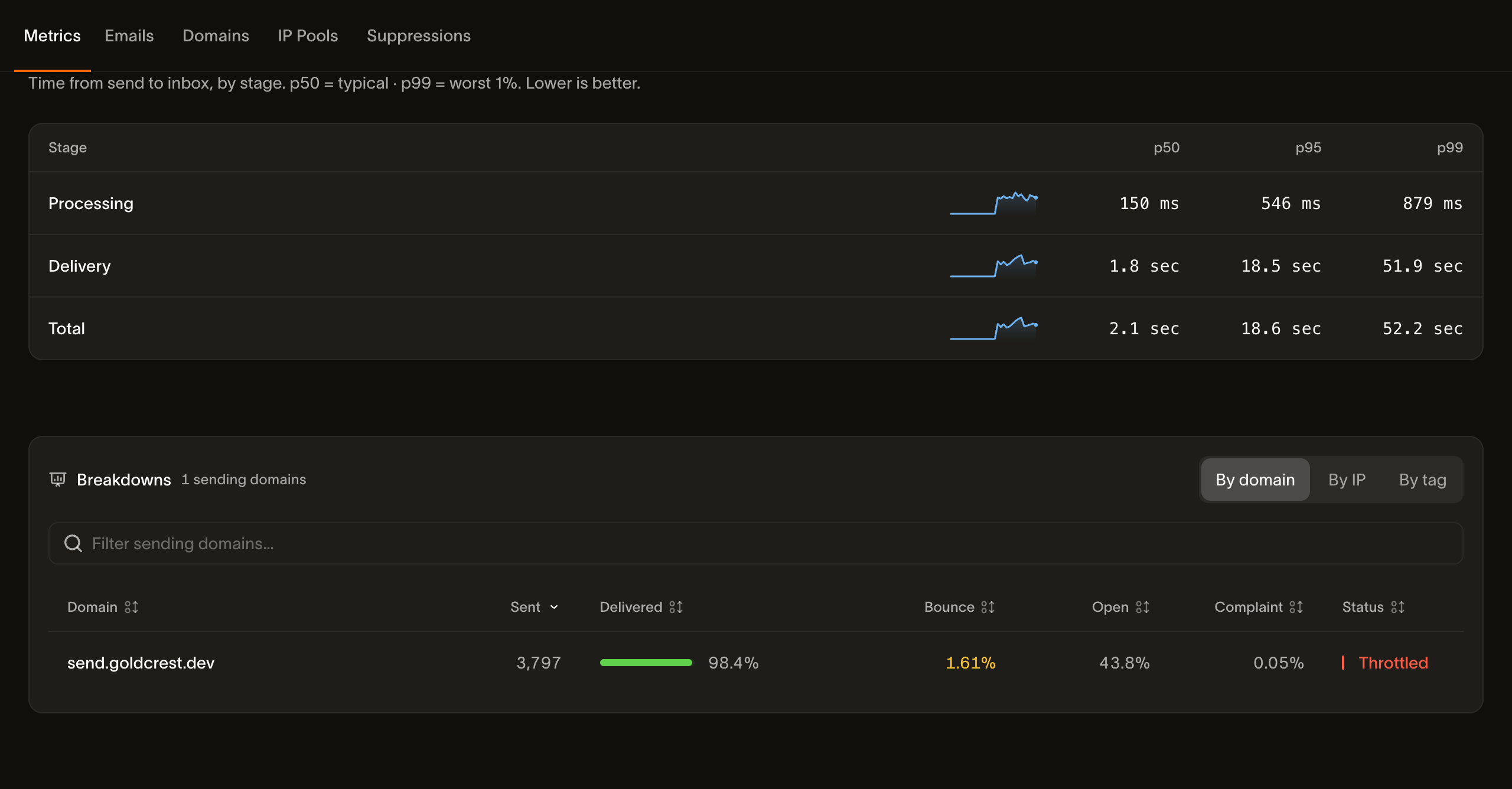
The Latency table splits time-to-inbox into Processing (the time we spend accepting and queueing the message), Delivery (time at the receiving server), and Total, each at p50, p95, and p99, with a sparkline per stage. Read p95 and p99 for the slow tail: a fast median with a slow p99 usually means one provider is deferring your mail.
Breakdowns
The Breakdowns panel slices the same delivery and engagement numbers one dimension at a time, so you can compare senders and isolate a problem to its source. Six tabs are always there, and Broadcast appears once you have sent a broadcast:
- Domain: the sending domain a message went out from.
- IP: the sending IP that carried it.
- Mailbox provider: Gmail, Microsoft, Yahoo, Apple and the rest. Start here when one provider treats your mail differently to the others.
- Recipient domain: the domain behind the address, which separates one bad corporate recipient from a whole provider.
- Tag: the tags you set at send time, the most flexible cut. Tag a campaign or an experiment variant and compare them directly.
- Template: the template the message was sent with.
Each tab lists sent, delivered, bounce, open, click, and complaint figures per row, plus a Status. The IP tab differs: it shows the pool each IP belongs to, not open or click, because engagement is not attributed to the IP that carried the message. Rows are ranked, filterable by name, and capped, so the panel says "Top 50 of 120 sending domains" when a range holds more senders than fit.

A row's Status is derived from its own delivery, bounce, and complaint rates, and the thresholds are stricter than the four cards use:
| Status | When a row gets it |
|---|---|
| Healthy | Complaints at or below 0.06%, bounces at or below 0.4%, delivery at or above 99% |
| Watching | One of those crossed, but complaints still at or below 0.1%, bounces at or below 0.6%, delivery at or above 98.4% |
| Throttled | Complaints above 0.1%, or bounces above 0.6%, or delivery below 98.4% |
Because the two scales differ, a single sender can read Throttled while all four cards read Healthy: the workspace-wide average absorbs one bad domain that the per-row view exposes. Treat a Throttled row as the sender to investigate first.
Inbound
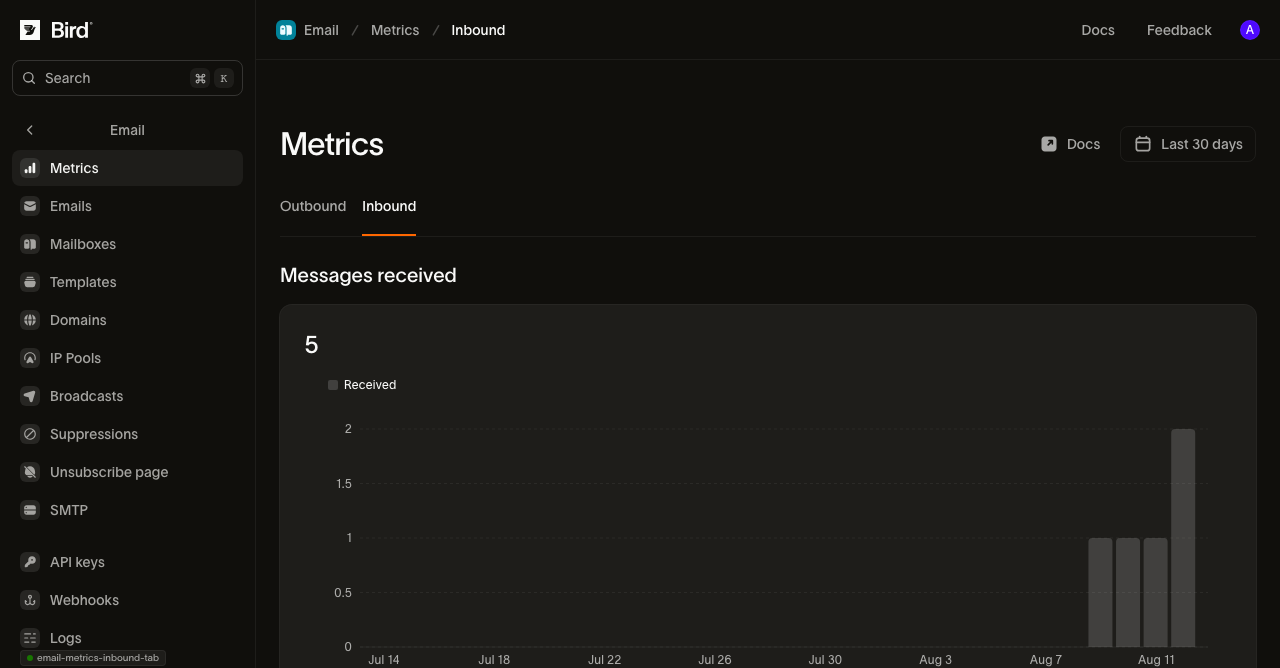
The Inbound tab covers what your workspace receives, once you have set up a forward address or your own domain for receiving. It shows one number, Messages received for the range you picked, and a chart of that volume over time.

A message you receive has no delivery, bounce, or complaint outcome the way a message you send does, so this count does not join the outbound health cards. Until you set up receiving, the tab reads zero.
Sandbox traffic counts
Sends to sandbox addresses on messagebird.dev move these numbers, including the bounce and complaint rates, because they run through the same pipeline as real mail. They never leave our systems, so they cannot touch your real sending reputation, but a heavy test run does change what a range containing it reports.
Advanced analytics
The Metrics page reads your own sending and receiving. Two more pages in the dashboard see past it: Inbox Insights measures where your mail actually lands across mailbox providers, and Competitive Insights shows what other brands send and how it performs beside your own figures.
Next steps
- Stats API: pull every number on this page from code
- Open and click tracking: the instrumentation behind the engagement numbers
- Email log: the per-message view behind the aggregates
- Events and webhooks: the per-recipient event stream both are built from
- Why your sending domain is throttled: a video that explains the three rates and what a throttled domain means for your sending