Metryki WhatsApp
Strona Metrics pod WhatsApp → Metrics pokazuje, jak wypadają Twoje wysyłki WhatsApp w całym obszarze roboczym. Aby sprawdzić pojedynczą wiadomość, użyj dziennika WhatsApp. Strona wymaga, aby Twoja rola w obszarze roboczym miała uprawnienia do odczytu WhatsApp oraz do odczytu analityki.
Odczytywanie metryk
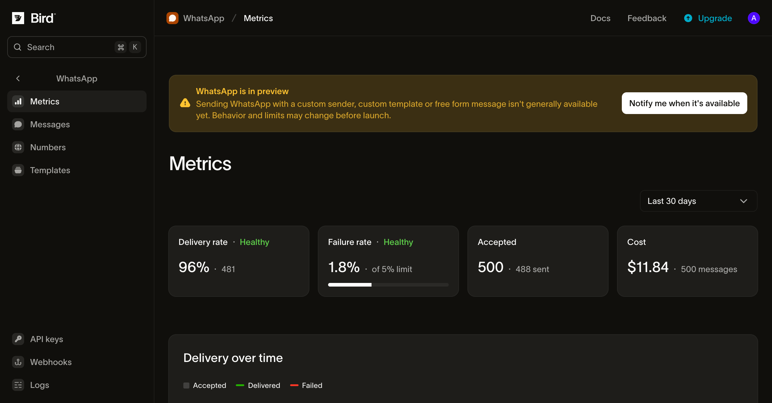
Zakres, filtr i karty
- Outbound / Inbound: karta Outbound obejmuje wysłane wiadomości. Karta Inbound zlicza wiadomości odebrane przez Twoje numery, łącznie i na numer.
- Range: ostatnie 24 godziny, 7, 30 (domyślnie) lub 90 dni. Możesz też przeciągnąć po wykresie, aby przybliżyć.
- Scope: tylko na karcie Outbound zawęź stronę do jednego numeru, szablonu, kategorii szablonu lub tagu, po jednym naraz. Dwie części strony ignorują ten filtr i zawsze obejmują cały obszar roboczy: lista kodów błędów i panel Breakdowns.
Wiadomości są zaliczane do okresu, w którym Bird je zaakceptował, więc potwierdzenie dostarczenia, które przychodzi dziś, aktualizuje wczorajsze liczby. Ostatnie godziny mogą pokazywać mniej dostarczeń, niż pokażą po nadejściu wszystkich potwierdzeń.
Kafelki podsumowania
| Kafelek | Pokazuje | Zdrowy, gdy |
|---|---|---|
| Delivery rate | Udział dostarczonych wiadomości w zaakceptowanych | Powyżej 90% |
| Failure rate | Udział nieudanych wiadomości w zaakceptowanych | Poniżej 5% |
| Accepted | Wiadomości zaakceptowane przez Bird i liczba tych, które dotarły do WhatsApp | Bez oceny |
Kafelek poza zdrowym zakresem pokazuje Needs attention. Sprawdź przyczyny niepowodzeń, aby dowiedzieć się dlaczego.
Dostarczenia w czasie
Wykres przedstawia liczbę zaakceptowanych, dostarczonych i nieudanych wiadomości na godzinę (zakres 24-godzinny) lub na dzień (dłuższe zakresy). Używaj go, aby wychwycić skok, na przykład po wysłaniu kampanii lub gdy szablon zaczyna być odrzucany.
Przyczyny niepowodzeń
Wykres wskaźnika niepowodzeń śledzi wskaźnik niepowodzeń w całym zakresie. Poniżej niepowodzenia są pogrupowane według kodu błędu, od najczęstszego. Lista pokazuje do 50 kodów, które wystąpiły w wybranym zakresie, więc przy długiej liście rzadki kod może się na niej nie znaleźć. Kody błędów zawsze obejmują cały obszar roboczy, nawet gdy zawęzisz stronę. Ostatni wiersz, Rejected, zlicza wiadomości, które Bird odrzucił przed ich zaakceptowaniem. Nie wliczają się one do wskaźnika niepowodzeń, więc wiersz pokazuje liczbę bez udziału procentowego.
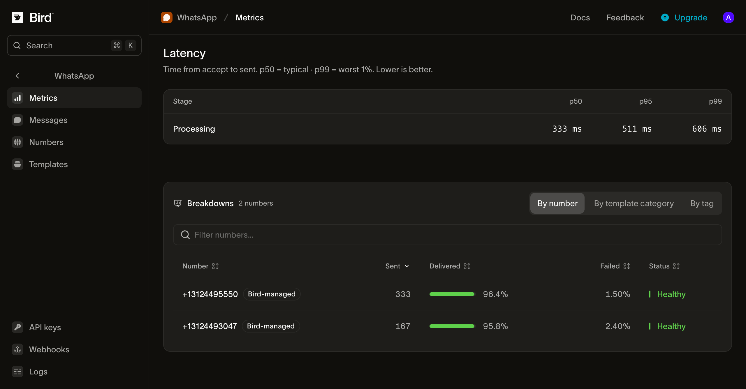
Opóźnienia
Tabela opóźnień pokazuje czasy p50, p95 i p99 dla trzech etapów:
- Processing: od zaakceptowania wiadomości przez Bird do przekazania jej do WhatsApp.
- Delivery: od przekazania do WhatsApp do potwierdzenia dostarczenia na urządzenie odbiorcy przez WhatsApp.
- Total: oba etapy razem.
Wolny etap Delivery zwykle oznacza, że telefony odbiorców były offline, na co Bird nie ma wpływu. Wolny etap Processing warto zbadać. Jeśli p50 wygląda dobrze, ale p99 jest wolne, przyczyną jest często jeden szablon lub kierunek.
Podziały
Panel Breakdowns dzieli zaakceptowane, dostarczone i nieudane wiadomości według numeru, szablonu, kategorii szablonu, tagu lub kraju. Każdy wiersz jest oznaczony jako Healthy lub Needs attention według tych samych progów co kafelki podsumowania. Każda zakładka wyświetla 50 najwyższych wierszy dla wybranego zakresu.
Tagi to te, które ustawiasz podczas wysyłania. Wiadomość z kilkoma tagami pojawia się w wierszu każdego z nich. Odbiorcy, których kraju nie da się ustalić, są wyświetlani pod ZZ, a wysyłki grupowe są pomijane w zakładce krajów.
Dostęp programowy
Te same liczby są dostępne przez API, SDK (bird.whatsapp.stats), CLI (bird whatsapp stats) oraz serwer MCP. Zacznij od tych endpointów:
- Statystyki zbiorcze, dzienne i godzinowe
- Podziały według numeru, szablonu, kategorii szablonu, tagu, kraju i kodu błędu
- Statystyki wiadomości przychodzących: zbiorcze, dzienne, godzinowe i według numeru
Każda strona referencyjna wymienia akceptowane zakresy czasowe, filtry i pola odpowiedzi.
Następne kroki
- Dziennik WhatsApp: wyszukaj pojedynczą wiadomość
- Zdarzenia statusów wiadomości: zdarzenia, z których te metryki są zbudowane
- Webhooki statusów wiadomości: otrzymuj każdą zmianę statusu na bieżąco
Powiązane zasoby
Przejdź do dokumentacji, przewodników i przykładów dotyczących tego tematu.