Metrik WhatsApp
Halaman Metrics di WhatsApp → Metrics menunjukkan performa pengiriman WhatsApp Anda di seluruh workspace. Untuk memeriksa satu pesan, gunakan log WhatsApp. Halaman ini memerlukan akses baca WhatsApp dan akses baca analitik pada peran workspace Anda.
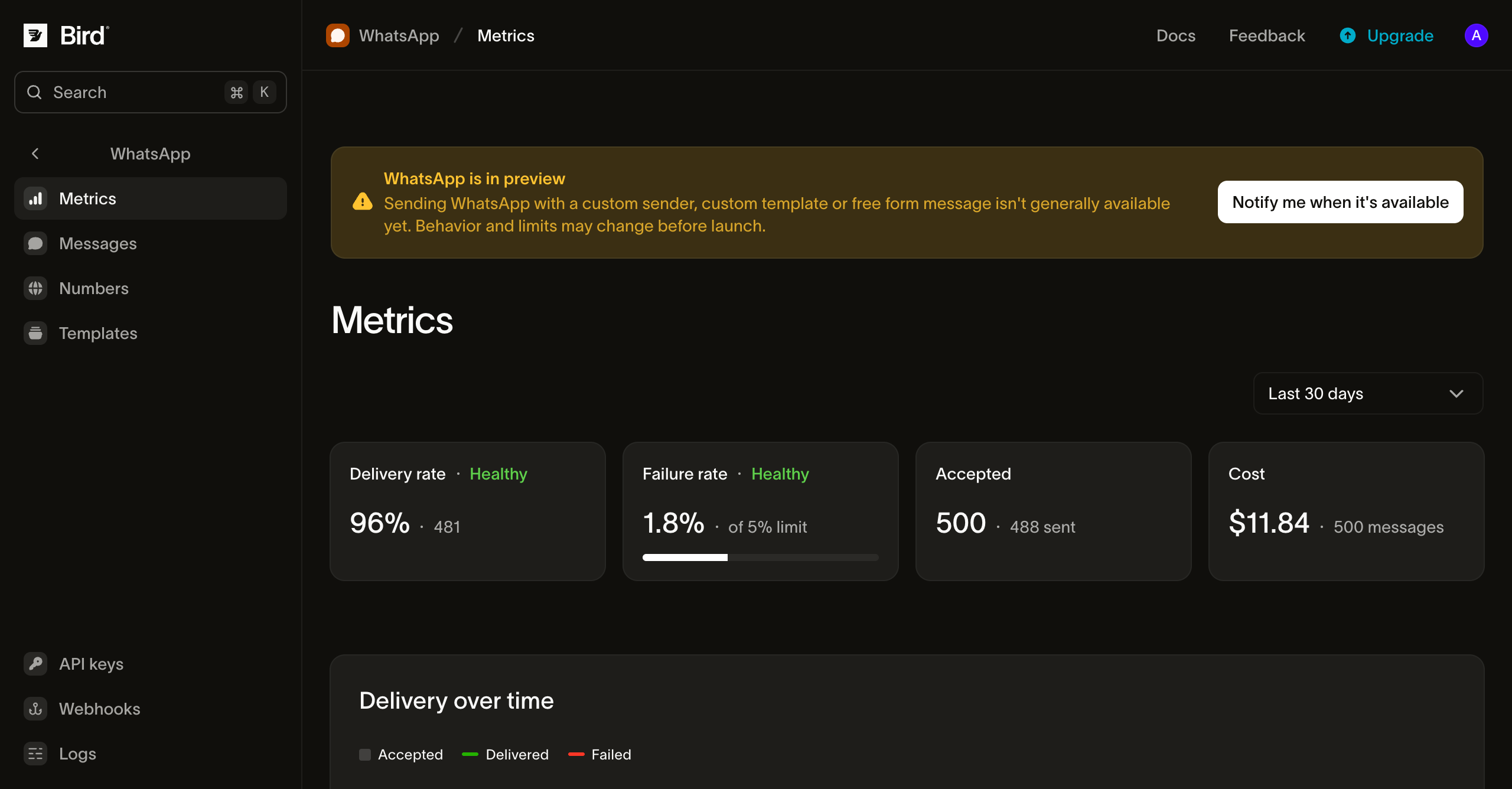
Membaca metrik Anda
Rentang, scope, dan tab
- Outbound / Inbound: tab Outbound mencakup pesan yang Anda kirim. Tab Inbound menghitung pesan yang diterima nomor Anda, secara total dan per nomor.
- Range: 24 jam terakhir, 7, 30 (default), atau 90 hari. Anda juga bisa menyeret di grafik untuk memperbesar.
- Scope: khusus di tab Outbound, persempit halaman ke satu nomor, template, kategori template, atau tag, satu per satu. Dua bagian halaman mengabaikan scope dan selalu mencakup seluruh workspace: daftar kode error dan panel Breakdowns.
Pesan dihitung ke periode saat Bird menerimanya, sehingga tanda terima pengiriman yang tiba hari ini memperbarui angka kemarin. Jam-jam terbaru bisa menampilkan lebih sedikit pengiriman daripada yang akan terlihat setelah semua tanda terima tiba.
Tile ringkasan
| Tile | Menampilkan | Healthy jika |
|---|---|---|
| Delivery rate | Pesan terkirim sebagai proporsi dari pesan accepted | Di atas 90% |
| Failure rate | Pesan gagal sebagai proporsi dari pesan accepted | Di bawah 5% |
| Accepted | Pesan yang diterima Bird, dan berapa banyak yang sampai ke WhatsApp | Tidak dinilai |
Tile yang berada di luar rentang healthy-nya menampilkan Needs attention. Periksa penyebab kegagalan untuk mengetahui alasannya.
Pengiriman dari waktu ke waktu
Grafik memplot pesan accepted, delivered, dan failed per jam (rentang 24 jam) atau per hari (rentang lebih panjang). Gunakan grafik ini untuk menemukan lonjakan, misalnya setelah kampanye dikirim atau template mulai ditolak.
Penyebab kegagalan
Grafik failure rate melacak tingkat kegagalan di sepanjang rentang. Di bawahnya, kegagalan dikelompokkan berdasarkan kode error, dengan yang paling umum di urutan pertama. Daftar ini menampilkan hingga 50 kode yang muncul dalam rentang tersebut, sehingga kode yang jarang muncul bisa tidak tercantum dalam daftar yang panjang. Kode error selalu mencakup seluruh workspace, bahkan saat Anda mempersempit scope halaman. Baris terakhir, Rejected, menghitung pesan yang ditolak Bird sebelum diterima. Pesan ini tidak termasuk dalam tingkat kegagalan, sehingga baris tersebut hanya menampilkan jumlah tanpa proporsi.
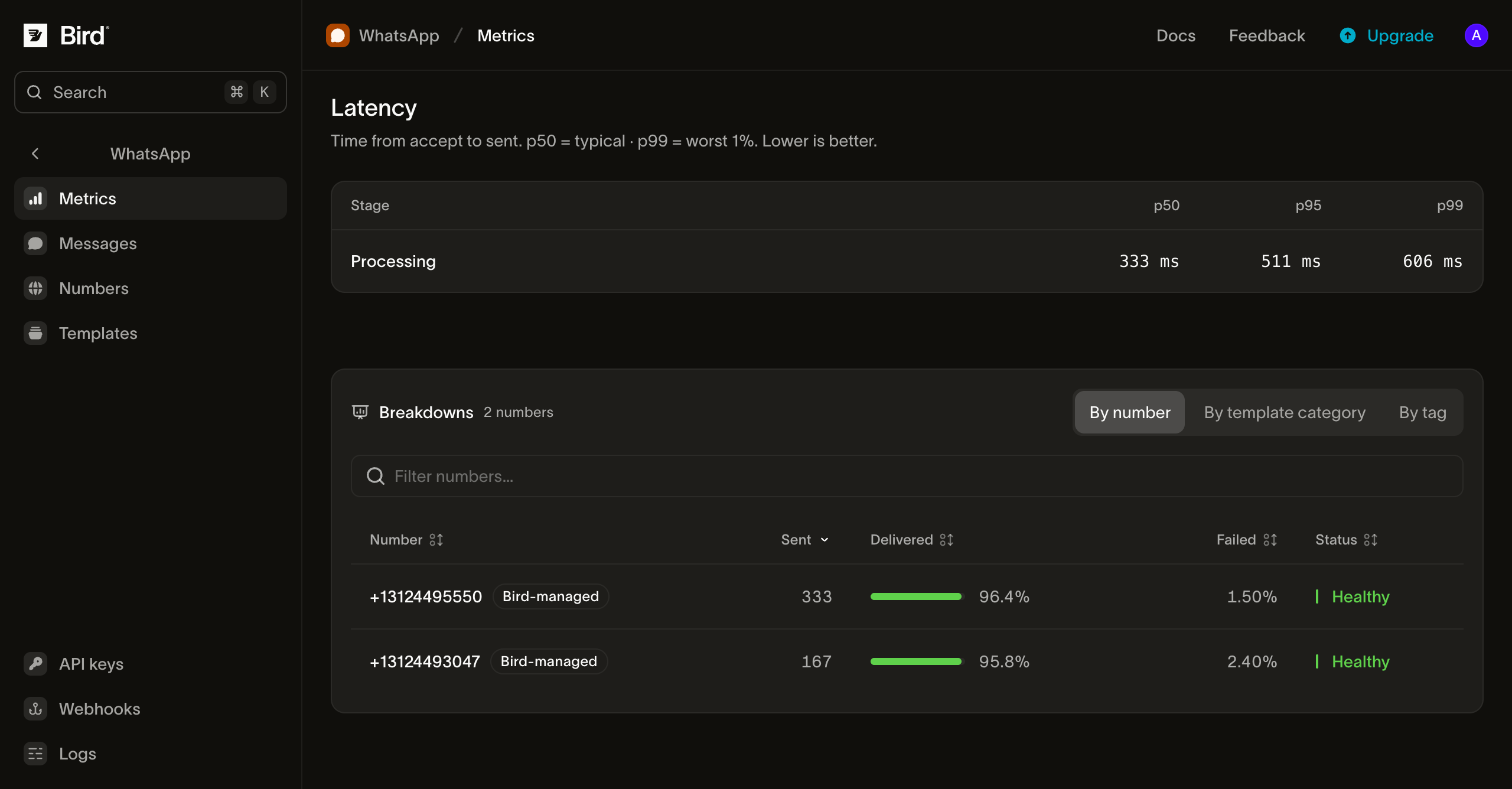
Latensi
Tabel latensi menampilkan waktu p50, p95, dan p99 untuk tiga tahap:
- Processing: dari saat Bird menerima pesan hingga menyerahkannya ke WhatsApp.
- Delivery: dari penyerahan ke WhatsApp hingga WhatsApp mengonfirmasi pengiriman ke perangkat penerima.
- Total: kedua tahap digabungkan.
Tahap Delivery yang lambat biasanya berarti ponsel penerima sedang offline, dan hal ini tidak dapat dikendalikan oleh Bird. Tahap Processing yang lambat perlu diinvestigasi. Jika p50 terlihat normal tetapi p99 lambat, penyebabnya sering kali satu template atau satu tujuan tertentu.
Rincian
Panel Breakdowns memecah pesan accepted, delivered, dan failed berdasarkan number, template, template category, tag, atau country. Setiap baris ditandai Healthy atau Needs attention dengan ambang batas yang sama seperti tile ringkasan. Setiap tab menampilkan 50 baris teratas untuk rentang tersebut.
Tag yang dimaksud adalah tag yang Anda atur saat mengirim. Pesan dengan beberapa tag muncul di baris setiap tag tersebut. Penerima yang negaranya tidak dapat diidentifikasi muncul di bawah ZZ, dan pengiriman grup tidak disertakan dalam tab negara.
Akses terprogram
Angka yang sama tersedia melalui API, SDK (bird.whatsapp.stats), CLI (bird whatsapp stats), dan server MCP. Mulai dari endpoint berikut:
- Statistik ringkasan, harian, dan per jam
- Rincian berdasarkan nomor, template, kategori template, tag, negara, dan kode error
- Statistik inbound: ringkasan, harian, per jam, dan berdasarkan nomor
Setiap halaman referensi mencantumkan rentang waktu yang diterima, filter, dan field respons.
Langkah selanjutnya
- Log WhatsApp: mencari satu pesan tertentu
- Event status pesan: event yang menjadi dasar penghitungan metrik ini
- Webhook status pesan: menerima setiap perubahan status secara real-time
Sumber daya terkait
Lanjutkan dengan dokumentasi, panduan, dan contoh untuk topik ini.