Metrik SMS
Halaman Metrics di dashboard Bird menunjukkan berapa banyak lalu lintas SMS yang sampai ke perangkat dan bagaimana tingkat kegagalan Anda berubah. Panduan ini menjelaskan setiap nilai dan kapan Anda perlu menyelidikinya.
Metrik adalah tampilan agregat dari semua yang dikirim workspace Anda. Hitungan menggunakan agregasi perkiraan pesan unik, jadi gunakan catatan pesan dan penagihan jika diperlukan rekonsiliasi persis. Untuk siklus hidup satu pesan (apakah nomor ini menerimanya), lihat log SMS dan events.
Membaca metrik Anda
Buka SMS > Metrics di dashboard. Pemilih rentang menyediakan 24 jam terakhir atau 7, 30, atau 90 hari. Nilai diperbarui seiring pengiriman dan tanda terima pengiriman tiba.
Rasio menggunakan waktu kirim setiap pesan. Tanda terima pengiriman yang tiba hari ini untuk pesan yang diterima kemarin dihitung ke hari kemarin, bersama accepted pesan tersebut. Setiap rentang dengan demikian menggambarkan pesan yang Anda kirim di dalamnya, dari awal hingga akhir. accepted adalah penyebut untuk kedua kartu rasio; ini adalah jumlah pesan yang kami terima dalam rentang tersebut, dan setiap rasio diukur terhadapnya.
Rentang yang mencakup pengiriman terbaru dapat sementara melaporkan delivered lebih rendah selama tanda terima masih berdatangan. Hitungan akan stabil setelah pesan-pesan tersebut selesai.
Tile ringkasan
Baris tile di bagian atas adalah pemeriksaan kondisi sekilas Anda:
- Delivery rate: pesan terkirim sebagai bagian dari pesan diterima. Statusnya Healthy di atas 95%; pada atau di bawah angka itu, ada sesuatu yang gagal menjangkau perangkat (nomor salah, konten diblokir, atau masalah rute) dan rincian kegagalan menunjukkan penyebabnya. Tile ini juga menampilkan perubahan dibanding periode sebelumnya.
- Failure rate: bagian dari pesan diterima yang berakhir
undelivered,failed, atauexpired. Tile menampilkan rasio Anda terhadap batas 5% dengan progress bar; mencapainya mengubah tile menjadi Risk. Tingkat kegagalan tinggi yang berkelanjutan biasanya berarti masalah kualitas daftar atau konten. - Accepted: jumlah mentah pesan yang diterima dalam rentang, dengan jumlah yang diteruskan ke operator (
sent) dan perubahan dibanding periode sebelumnya.
Dashboard menggunakan ambang batas 95% dan 5% untuk label Healthy dan Risk. Label Healthy tidak berarti setiap pesan berhasil terkirim.
Pengiriman dari waktu ke waktu
Grafik pengiriman menampilkan volume accepted, delivered, dan failed di sepanjang rentang sehingga Anda dapat melihat tren dan lonjakan satu kali: kampanye yang buruk, impor daftar nomor yang keliru, atau rute yang menurun kualitasnya. Seri failed di sini menggabungkan semua hasil non-pengiriman (undelivered, failed, dan expired) ke dalam satu garis. Ukuran bucket mengikuti rentang (per jam untuk 24 jam, per hari untuk jendela yang lebih panjang).
Tingkat kegagalan dan penyebabnya
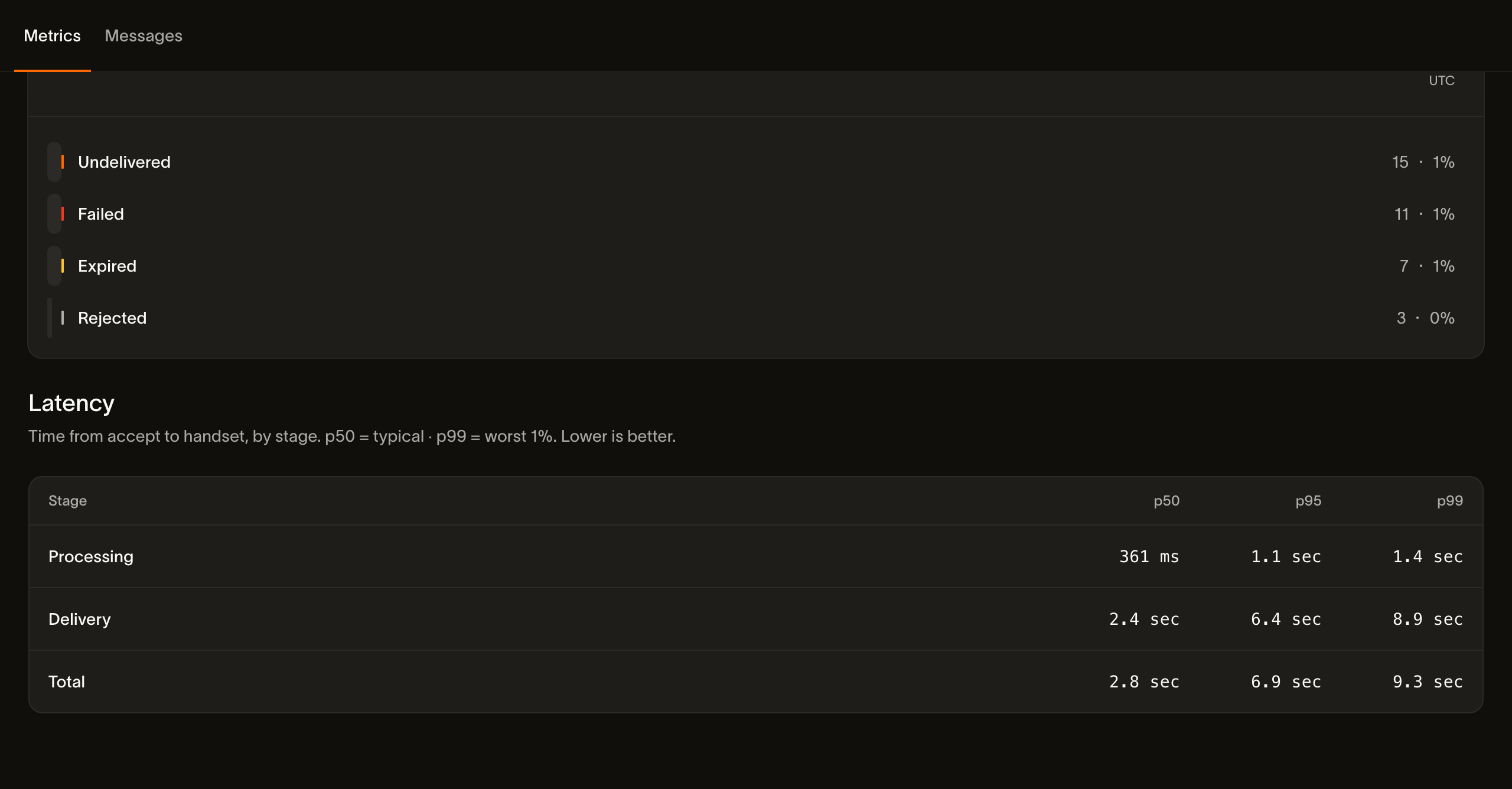
Halaman Metrics juga menampilkan tingkat kegagalan per bucket dan mengelompokkan non-pengiriman berdasarkan penyebab dalam histogram hasil:
- Undelivered: non-pengiriman yang tidak permanen. Perangkat mati atau tidak terjangkau.
- Failed: kegagalan permanen; pesan tidak dapat terkirim.
- Expired: operator berhenti mencoba dan melaporkan pesan sebagai kedaluwarsa. Bird tidak menetapkan jendela validitas sendiri.
- Rejected: pesan ditolak (pemeriksaan kebijakan, tagihan gagal, atau operator yang menolaknya) alih-alih dicoba dan hilang.
Setiap bucket menampilkan jumlahnya, dan semua kecuali rejected menampilkan bagiannya dari pesan diterima. Saat merekonsiliasi angka: tile Failure rate menghitung undelivered, failed, dan expired, sedangkan rejected ditampilkan dalam histogram ini tetapi berada di luar perhitungan failure rate. Pesan yang ditolak memang ditolak, bukan hilang dalam pengiriman, sehingga dilacak terpisah dari kegagalan pengiriman.
Latensi pengiriman
Tabel latensi membagi waktu menjadi Processing, Delivery, dan Total. Processing berjalan dari penerimaan hingga serah terima ke operator; Delivery berjalan dari serah terima hingga hasil pengiriman yang dilaporkan; Total mencakup penerimaan hingga hasil tersebut. Setiap tahap mencakup persentil p50, p95, dan p99. Gunakan p95 dan p99 untuk mengidentifikasi operator atau tujuan yang lambat. Latensi mencakup seluruh jendela, dan persentil tanpa data menampilkan tanda strip.
Akses programatik
Stats API menyediakan ringkasan, seri, dan rincian yang sama seperti dashboard. Rincian mencakup negara, operator, originator, kategori, status, kode kesalahan, dan pesan masuk. Nilai cocok dengan dashboard untuk rentang yang sama.
Untuk rekonsiliasi per pesan alih-alih agregat, konsumsi webhook events saat terjadi, atau telusuri halaman demi halaman melalui GET /v1/sms/messages.
Langkah selanjutnya
Gunakan analitik SMS untuk menghubungkan pelaporan pengiriman dengan alur kerja kampanye atau aplikasi yang lebih luas.
- Stats API: ambil setiap nilai di halaman ini dari kode.
- Log SMS: periksa pesan-pesan di balik agregat.
- Events: konsumsi event di balik metrik.
- Sending SMS: tinjau kategori, tag, segmen, dan pengeluaran.
Sumber daya terkait
Lanjutkan dengan dokumentasi, panduan, dan contoh untuk topik ini.