Competitive Insights
Metrik Anda sendiri menunjukkan performa program email Anda; metrik tersebut tidak mengatakan apa pun tentang pengirim lain yang bersaing untuk inbox yang sama. Halaman Competitive Insights membandingkan program Anda dengan program mereka: volume pengiriman, frekuensi, inbox placement, read rate, dan kampanye yang diamati panel pengukuran dari merek lain, disandingkan dengan angka terukur Bird milik Anda.
Buka Email > Competitive Insights di dashboard. Tab Overview berisi watchlist Anda, dan tab Compare menyandingkan hingga lima merek yang dipantau secara langsung dengan Anda. Memilih merek yang dipantau akan membuka profilnya.
Buat watchlist Anda
Pilih Add competitor dan cari berdasarkan nama merek atau domain pengirim. Menambahkan merek akan melacak domain pengirim bervolume tertinggi milik merek tersebut, dan setiap angka yang ditampilkan diukur dari domain itu. Merek yang membagi pengiriman ke beberapa domain akan terlihat lebih rendah sebesar volume yang dibawa domain lainnya.
Organisasi Anda dapat memantau 10 merek secara default, dihitung dari semua workspace-nya, dan batas ini dapat disesuaikan. Menghapus merek langsung membebaskan slotnya.
Membaca overview
Pemilih rentang menyediakan Last 7 days, Last 30 days, dan Last 90 days, dengan default 30 hari. Kartu di atas tabel merangkum periode tersebut: volume pengiriman kompetitor, inbox placement Anda, dan frekuensi pengiriman Anda dibandingkan median sesama, ditambah porsi volume Anda di antara Anda dan semua merek yang Anda pantau.
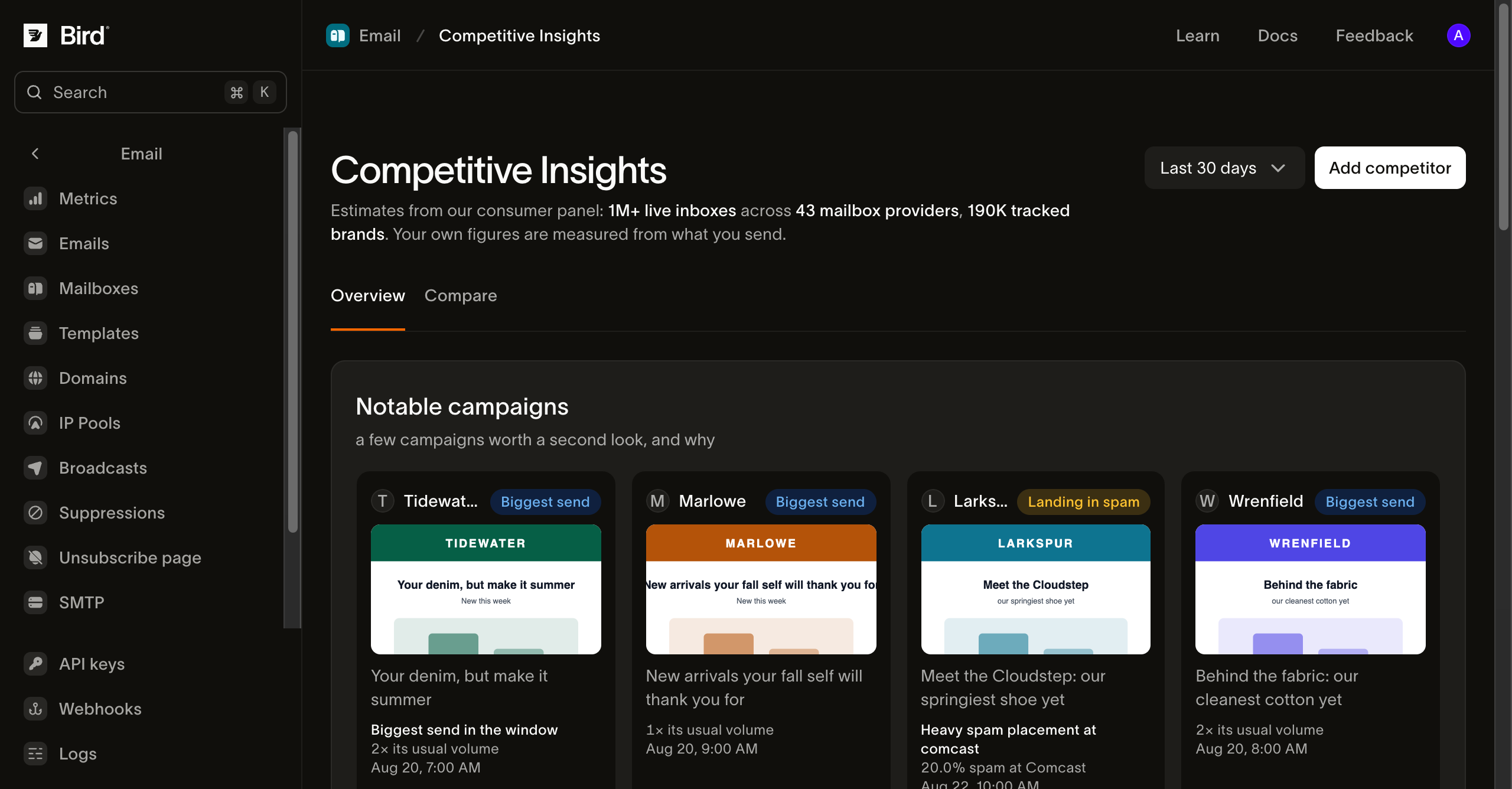
Setiap baris watchlist memuat kumpulan angka yang sama:
- Est. sends: semua yang dikirim merek dalam periode tersebut, inbox dan spam digabungkan. Panel memproyeksikan angka ini dari sampel kotak surat nyata, jadi perlakukan sebagai estimasi dengan presisi kasar, terutama untuk pengirim kecil.
- Cadence / week: kampanye yang dikirim per minggu dari domain yang dilacak.
- Inbox placement: proporsi email yang teramati masuk ke inbox, bukan spam.
- Est. read rate: proporsi email terkirim milik merek yang dibaca, sebagaimana panel mengukur pembacaan. Ini adalah estimasi panel dan tidak dapat dibandingkan dengan open rate terukur Bird Anda, yang menghitung secara berbeda.
- Audience overlap: proporsi audiens Anda yang juga terlihat oleh panel menerima email merek ini. Overlap diukur per pasangan domain dan sering kali tidak terukur, yang ditampilkan sebagai tanda hubung, bukan nol.
- Last campaign: kampanye terbaru yang ditangkap panel, beserta materi kreatifnya jika berhasil ditangkap.
Baris You menjalankan domain pengirim bervolume tertinggi milik Anda melalui sudut pandang yang sama. Volume pengiriman dan frekuensi pada baris ini diukur dari pengiriman aktual Anda; placement dan read rate adalah estimasi panel seperti baris lainnya, dan setiap angka diberi label sesuai sumbernya. Baris Anda tidak menampilkan audience overlap, karena overlap diukur terhadap domain Anda.
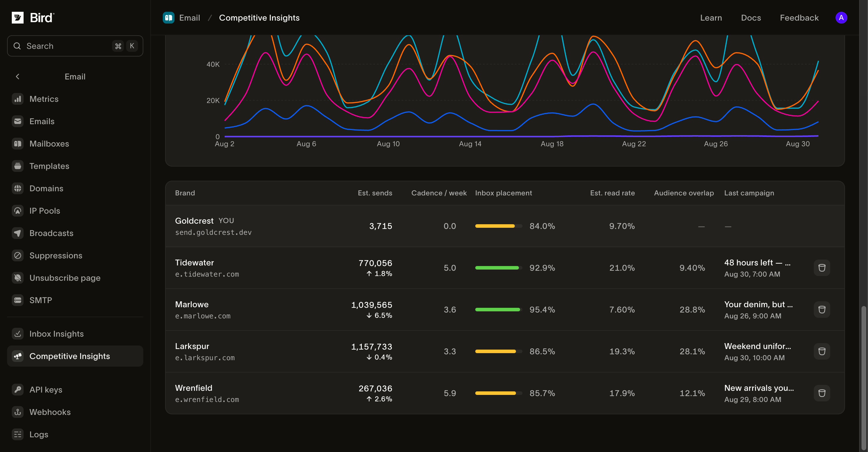
Di bawah tabel, Notable campaigns menampilkan pengiriman yang menonjol di antara merek yang Anda pantau, misalnya merek yang mengirim berlipat ganda dari volume biasanya atau kampanye yang masuk spam di suatu provider. Latest sends menampilkan email terbaru yang ditangkap dari watchlist Anda, dan Send volume over time memplot volume harian untuk merek yang dipantau dan Anda.
Profil merek
Memilih merek akan membuka profilnya: angka utama yang sama, ESP yang digunakan untuk mengirim jika panel mengetahuinya, dan tiga panel yang lebih mendalam.
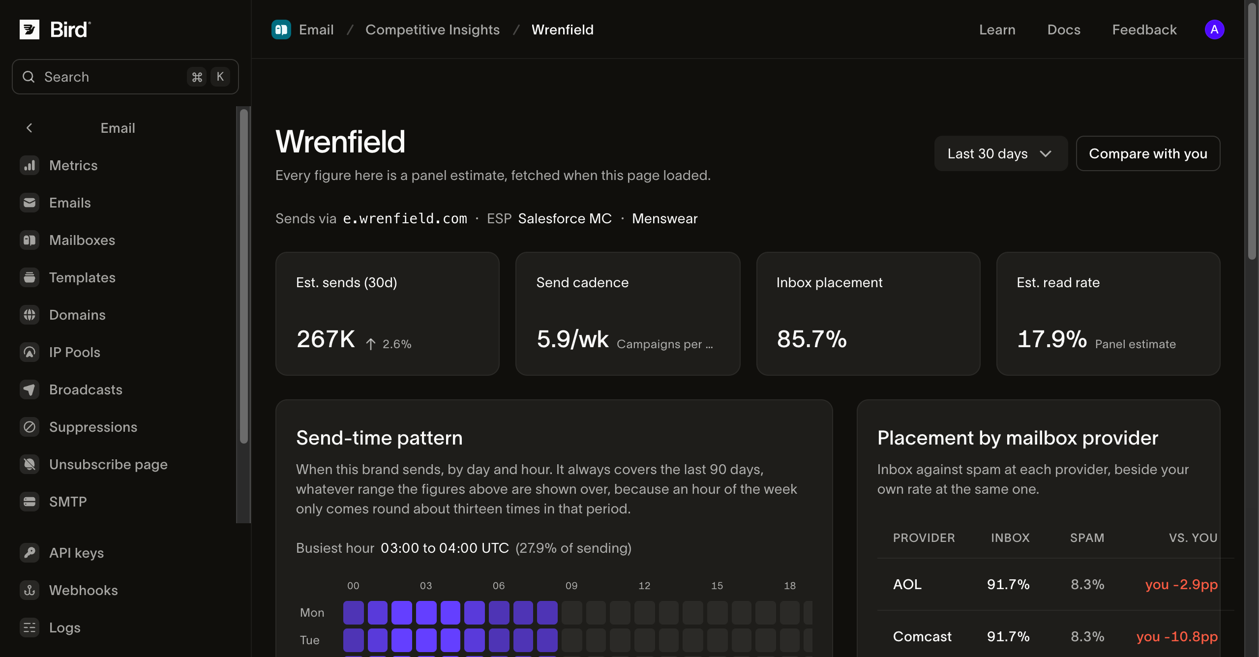
Placement by mailbox provider memecah tingkat inbox dan spam merek per provider, dengan kolom vs. you yang membandingkan placement Anda di provider yang sama. Baris mencakup provider mana pun yang diamati panel untuk merek tersebut; Gmail, Outlook, Yahoo, AOL, dan Comcast adalah yang paling sering dilaporkan.
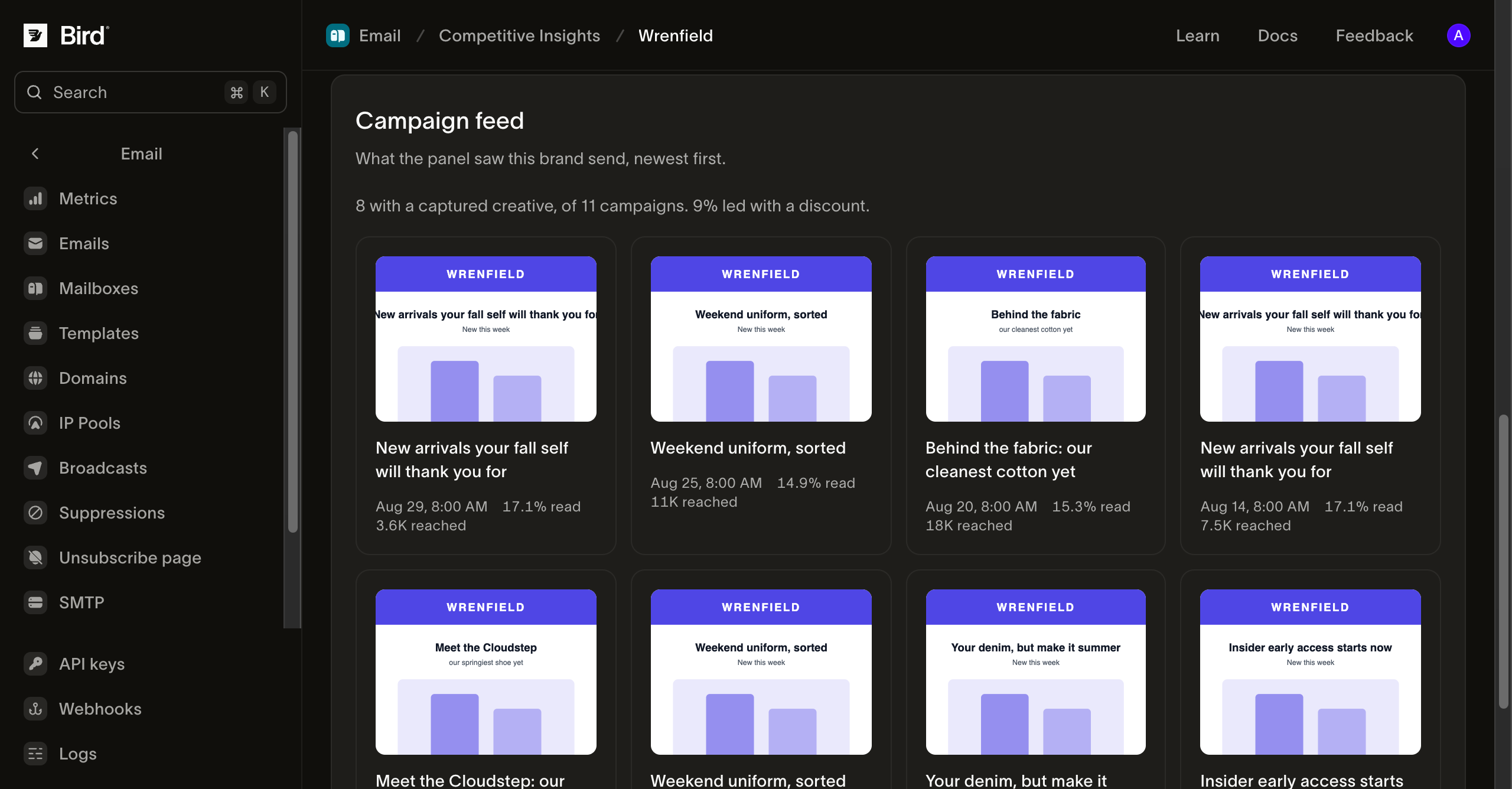
Campaign feed menampilkan materi kreatif yang ditangkap, baris subjek, rasio baca, dan perkiraan jangkauan, diurutkan dari yang terbaru. Grid menampilkan kampanye dengan materi kreatif yang ditangkap dari kumpulan hasil terbaru yang terbatas. Jumlah kampanye dan proporsi diskon di dalamnya menggambarkan sampel terbatas dalam periode yang dipilih. Memilih kampanye yang ditautkan akan membuka detailnya: perkiraan jangkauan, rasio baca, rasio inbox dan spam, serta materi kreatif yang ditangkap dalam ukuran penuh.
Send-time pattern memetakan pengiriman merek berdasarkan hari dan jam dalam zona waktu Anda, dengan jam tersibuk yang disorot. Grid ini selalu mencakup 90 hari terakhir, apa pun pengaturan pemilih rentang, dan dapat tertinggal hingga satu hari dari angka di sampingnya.
Bandingkan merek secara langsung
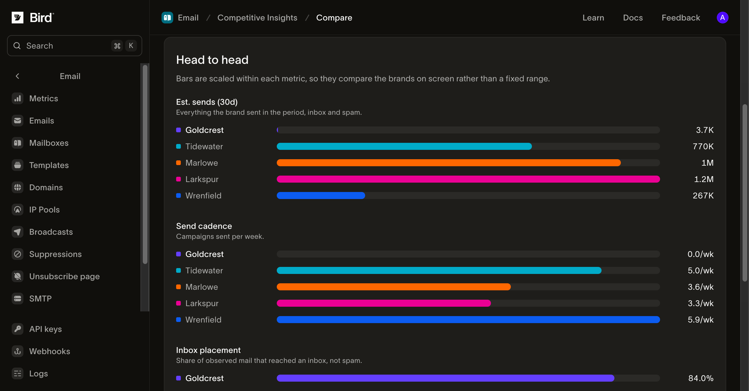
Tab Compare menampilkan grafik Anda dan hingga lima merek yang dipantau, satu warna per merek, untuk estimasi pengiriman, inbox placement, frekuensi pengiriman, dan estimasi read rate pada periode yang dipilih. Gunakan tab ini ketika pertanyaannya adalah peringkat, bukan perilaku satu merek.
Cara angka diukur
Setiap angka kompetitor adalah estimasi panel, diamati dari sampel kotak surat nyata dan diproyeksikan, dan setiap angka diambil secara langsung saat halaman dimuat, bukan dari salinan tersimpan. Angka dapat bergeser sedikit antar pemuatan seiring pergerakan sampel panel, dan merek yang jarang diamati panel memiliki margin kesalahan lebar meskipun digitnya terlihat presisi.
Saat angka tidak tersedia
- Not tracked by the panel: domain terlalu kecil atau terlalu baru untuk diamati oleh panel. Memantaunya tetap menggunakan satu slot, dan tidak ada angka yang muncul sampai panel mulai melacaknya.
- No mail seen in this period: panel melacak domain tersebut tetapi tidak mengamati email apa pun dalam rentang yang Anda pilih.
- Figures unavailable right now: panel tidak dapat dijangkau saat halaman dimuat. Daftar pantau Anda sendiri tidak terpengaruh; coba lagi.
Langkah selanjutnya
- Inbox Insights: pengukuran penempatan yang sama, diarahkan ke domain Anda sendiri
- Metrik email: angka pengiriman dan engagement Anda sendiri
- Broadcasts: kampanye di sisi Anda dalam perbandingan ini
Sumber daya terkait
Lanjutkan dengan dokumentasi, panduan, dan contoh untuk topik ini.